Team: UX/UI Designer, UX Lead, Front-End Developer, Tech Lead
My Role: UX/UI Designer
Deliverables: Wireframes, Interactive High-fidelity Prototype, Illustrations
Tools: Figma, Illustrator, Photoshop, Teams, Jira
How to give visibility to a trading platform for investments in the international market by creating a website that simplifies the complexity of the product and showcases its functionalities, resources, and costs?
We developed BlackArrow's website, which generated a large number of registrations and boosted Nelogica's expansion into the international market.
Context
The largest investech in Latin America is entering the international market
Nelogica, the largest investech in Latin America, aims to enter the international market through BlackArrow, its newest product. BlackArrow is a complex software for trading assets on international markets.
Objectives
• Create a website to give visibility to the new product;
• Provide information about the features;
• Facilitate access to the software.
• Provide information about the features;
• Facilitate access to the software.
Problem
How can we simplify the complex to make it easier to understand?
The main challenge of this project was the complexity of the product. BlackArrow is a software with numerous tools and complex functionalities. How could we make it easier for users to understand such a complex product?
Target audience
What do we already know about the users?
The company already had some information about the users and we didn't have time to conduct more in-depth research.
• Target audience consists of individual and professional investors;
• They have different levels of investment experience, from novice traders to professionals;
• Clearly understanding the costs is essential to avoid unpleasant surprises;
• Stability and security to operate smoothly;
• Needs a variety of features, tools and types of assets available.
Process
Briefing
Understanding and aligning requirements
The first step in the process was to meet with stakeholders to align the project requirements so that we were all on the same page. In this meeting, the following requirements were defined:
• The website's look should follow the the visual identity standard, which was not yet 100% defined;
• Use the content that the marketing team had created for the website;
• All images, including mockups and illustrations, were included in the project scope;
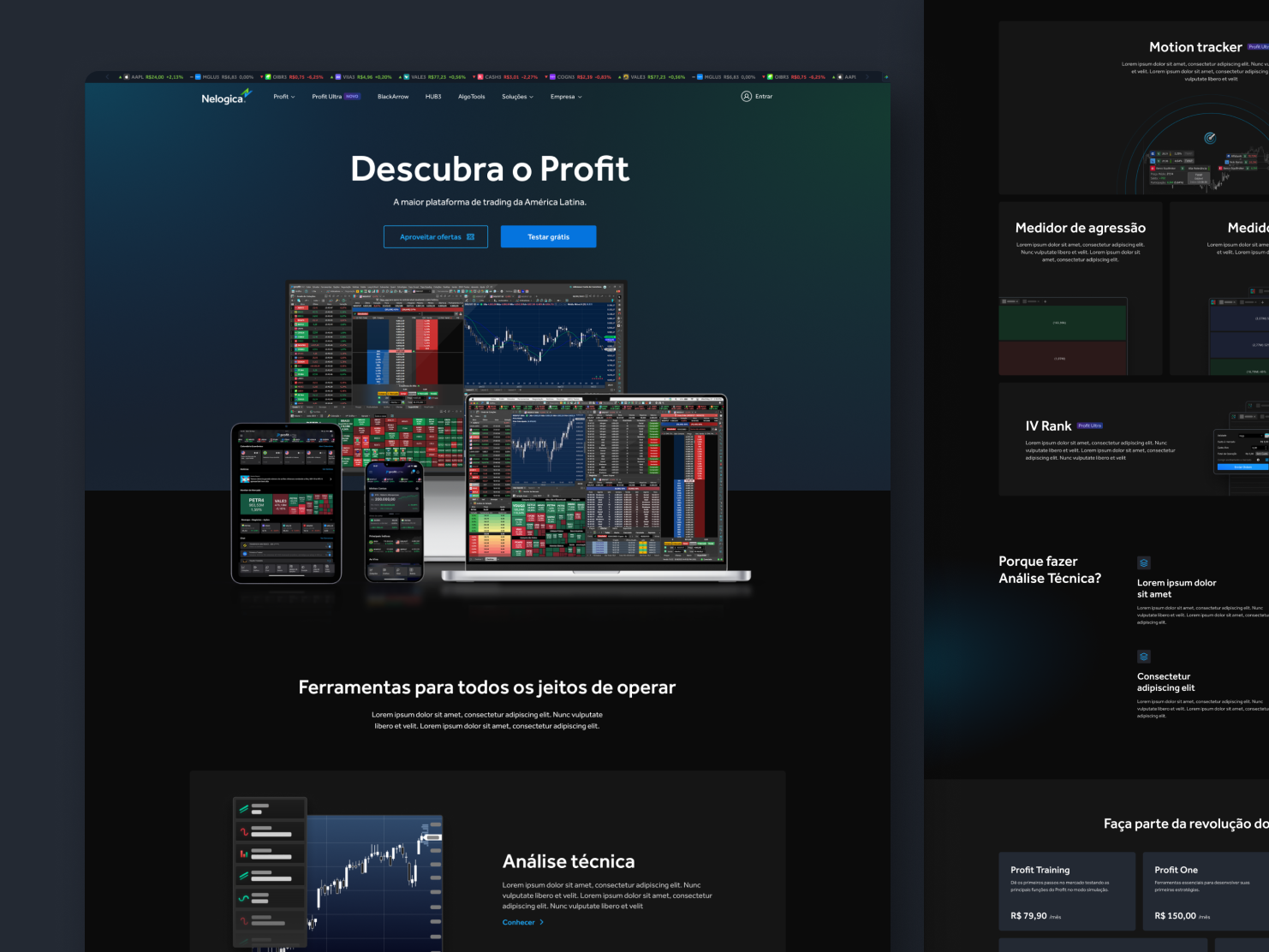
• The information architecture and structure of the website should be the same as another Nelogica product: Vector;
• The entire user area and contracting flow of the product would also follow Vector's structure.
Benchmarking
What solutions already exist, and what can we learn from them?
After alignment, we began to seek references from direct and indirect competitors to learn and identify new opportunities.
• Using simple illustrations and snippets of software screens can be a more user-friendly approach to complex screens and concepts;
• In addition to illustrations, it is necessary to show high-fidelity platform screens to build trust;
• Creating a more immersive experience is possible by using some fixed elements and others that are animated when scrolling the screen;
• It is important to clearly communicate BlackArrow's benefits, including sections on the advantages of its features and Nelogica's reputation as a consolidated company in the market.
Ideation
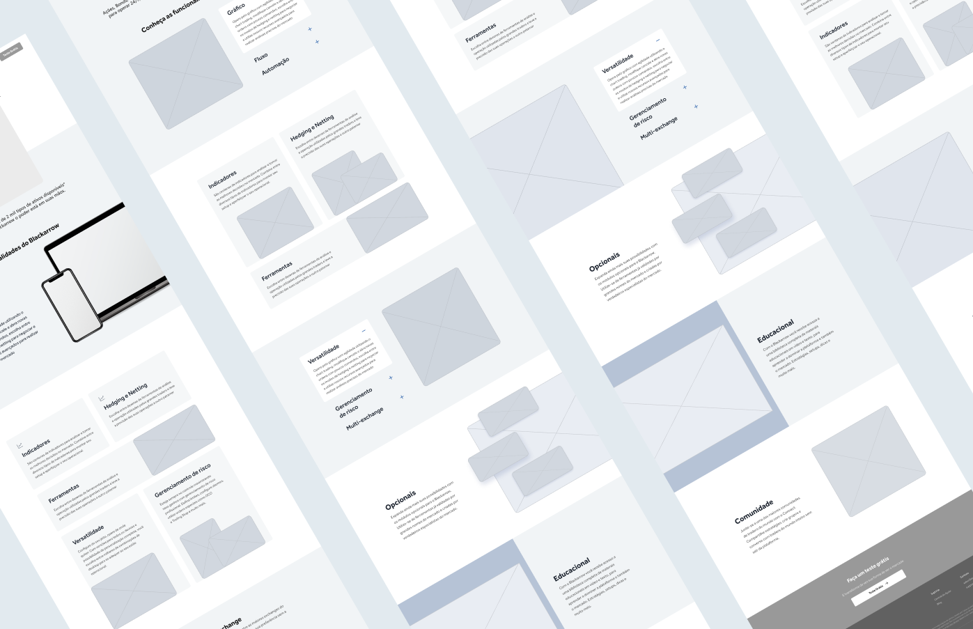
Wireframes
In order to make learnings and opportunities tangible, we developed wireframes for the website screens. The screens were divided between me and another UX/UI Designer on the team.
At this time, we also received the first version of the visual identity developed by the marketing team.
Adversities
Refinement, iteration, and project changes
From this stage on, I began working on the project alone, supervised by the UX Lead. I received the second version of the visual identity and, based on it, I started creating font styles, color palettes, components, mockups, and illustrations.
I always try to align the requirements before starting a project. However, some stakeholders were not as involved at the beginning and some new requirements were introduced, such as not using certain colors and adding new sections to some pages.
I collaborated with the development team and stakeholders to validate and iterate on the design of the screens, making adjustments based on the feedback received.
Solution
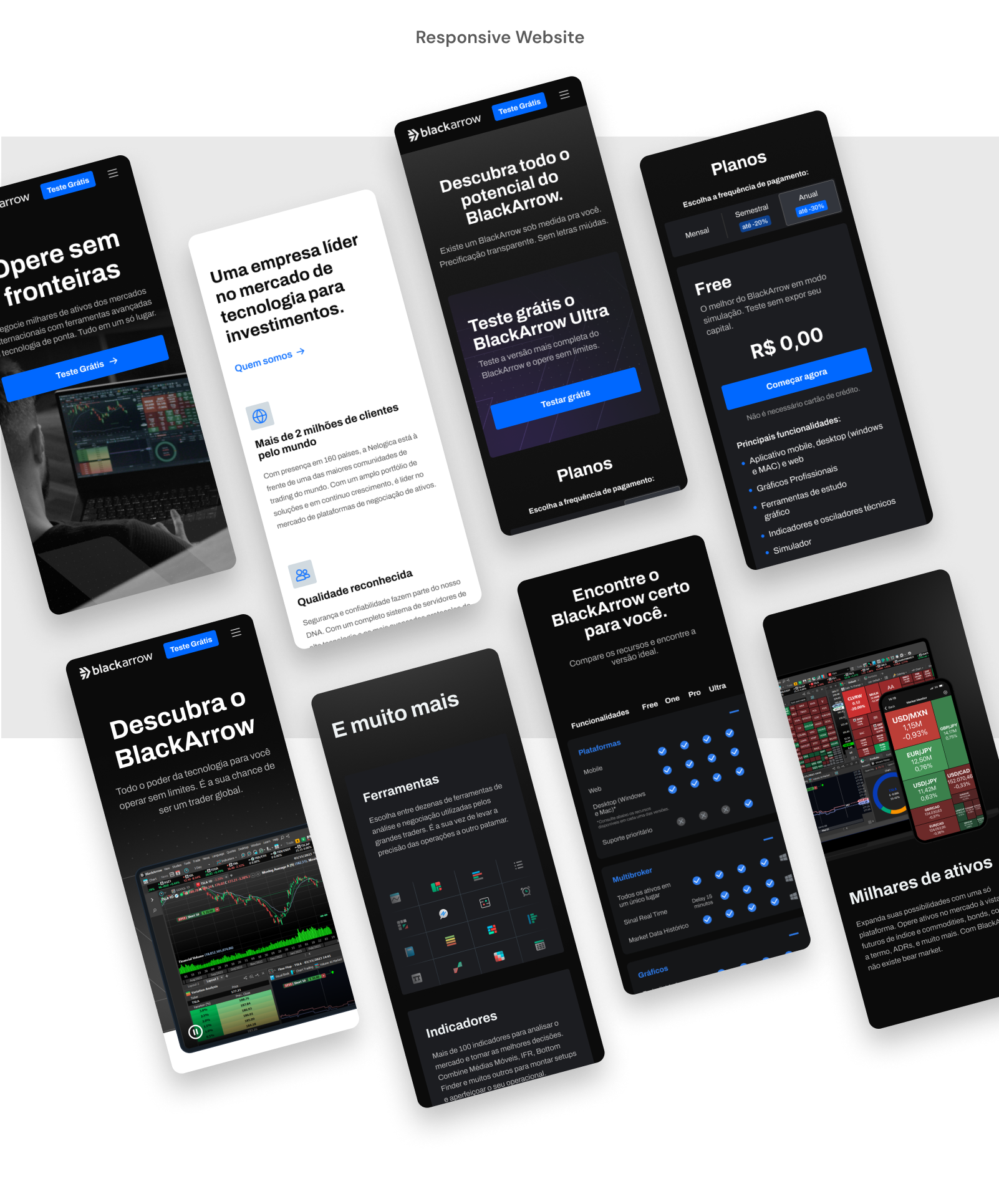
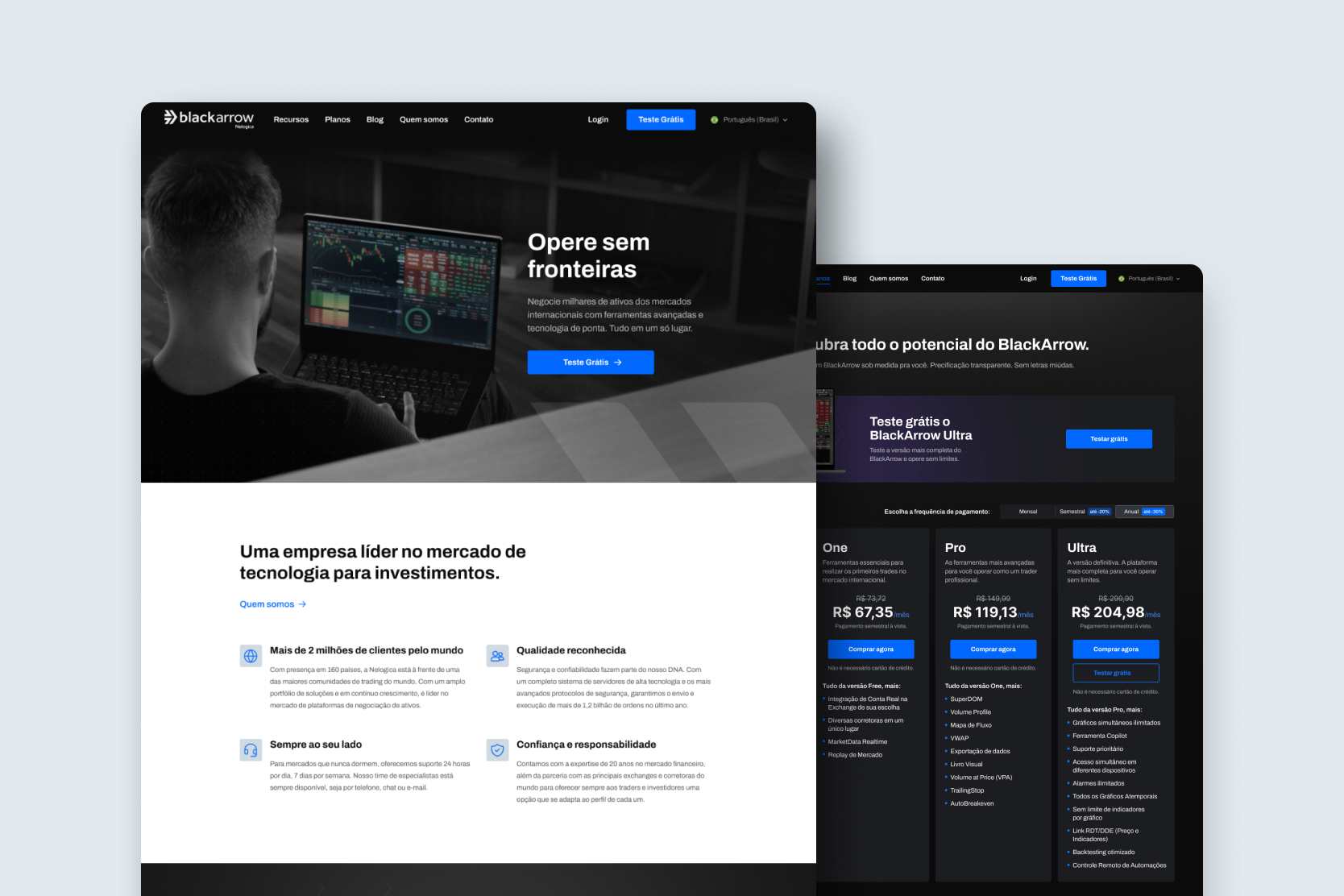
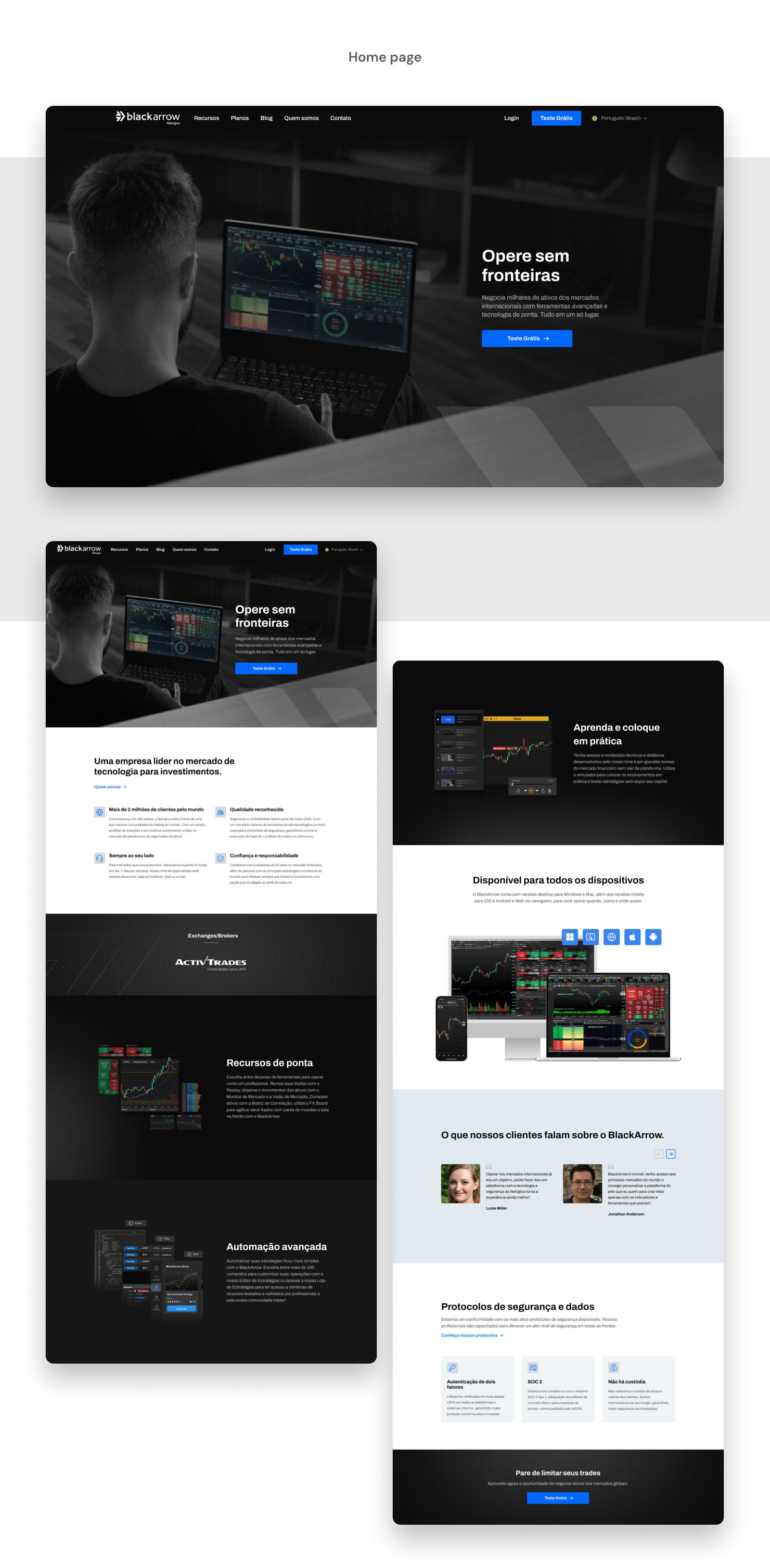
Home page
A summary of BlackArrow's main features, including illustrations and snippets of platform screens to provide a more user-friendly and lightweight approach.
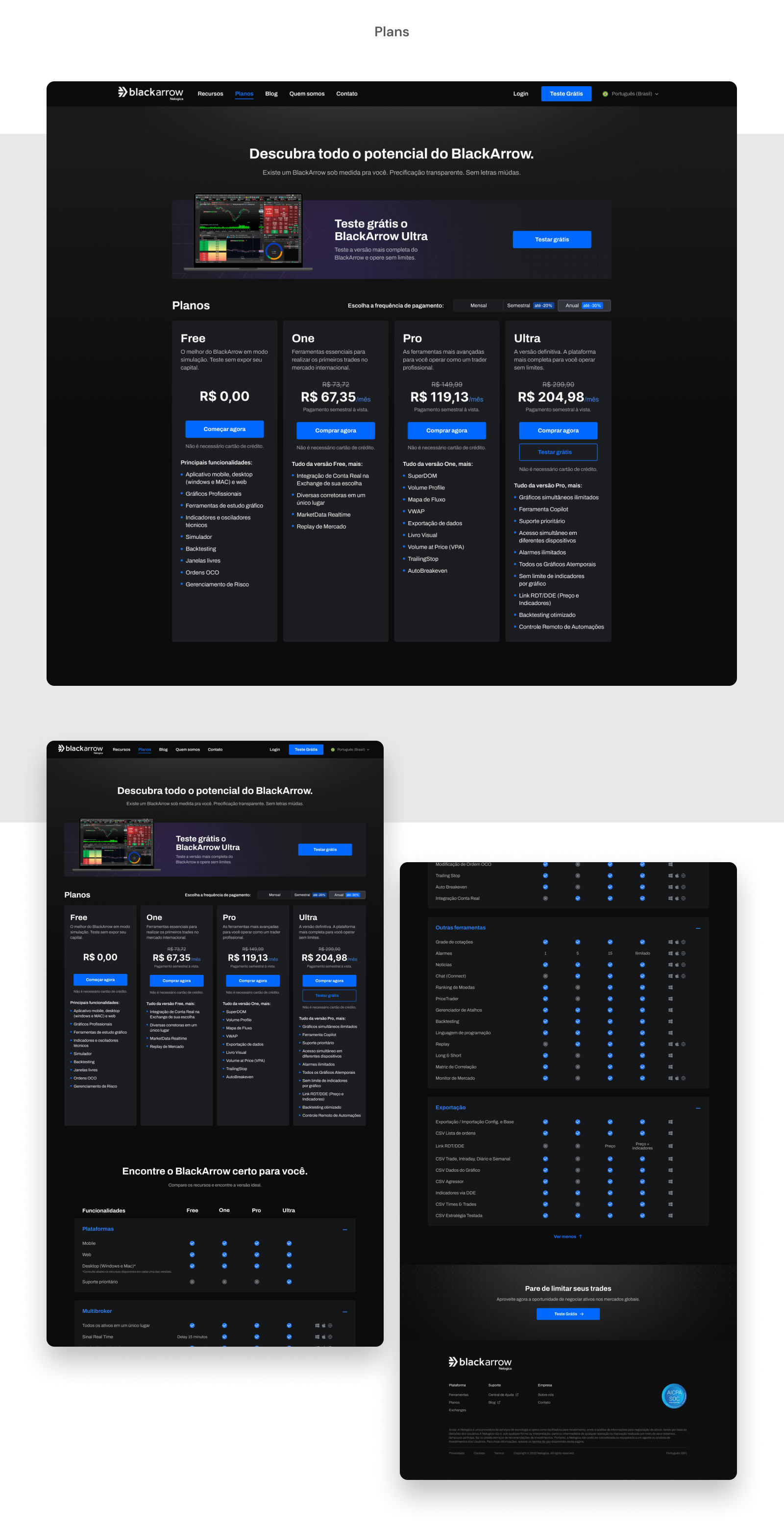
Plans page
It provides two ways to compare plans: a summary and a detailed one. The detailed one uses accordions to avoid overwhelming the user with too much information.
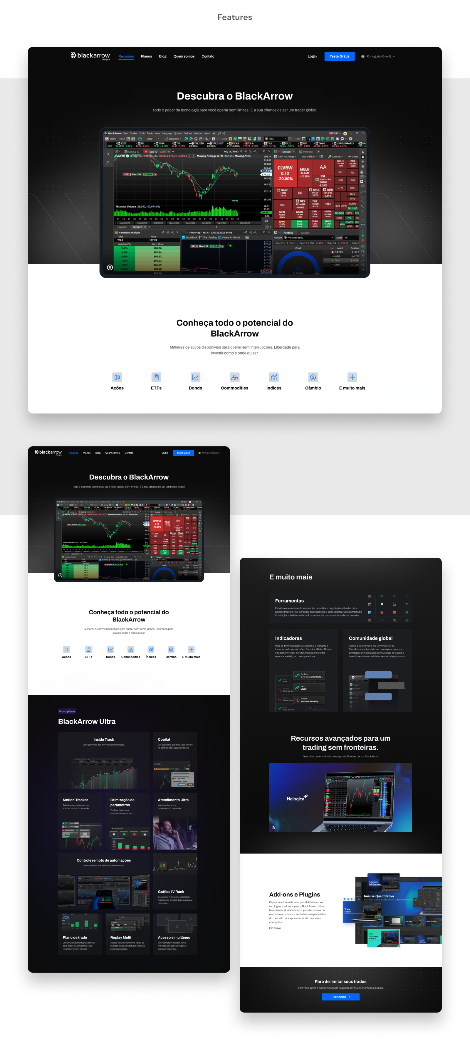
Features page
Provides more information about the platform's features, including illustrations as well as high-fidelity platform screens to build trust.
Lessions learned
• It is important to involve all stakeholders in meetings and presentations of deliverables from the beginning of the project;
• Complex information can be conveyed in a simple and user-friendly way using illustrations;
• Sometimes it is necessary to review the implementation more than once to ensure quality.
Results
The results were a group effort by the teams involved in the project: development team, UX, Marketing and Business Intelligence.
• More than 25,000 new registrations on the website in the first week
• More than 84,000 orders placed on the platform
• The launch of BlackArrow allowed the company to reach the international market